

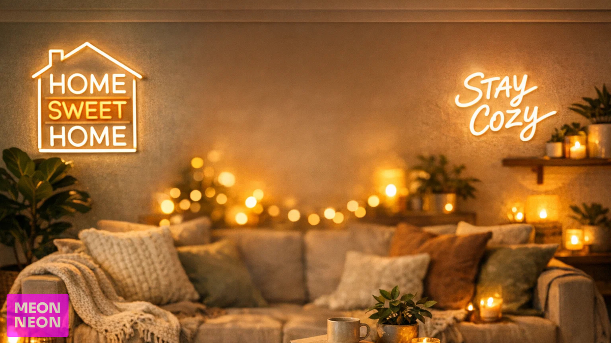
"What size should I get?" is the question we hear more than any other. A sign that looks huge on a screen can feel small on a real wall, and a sign sized for a bedroom can disappear in a restaurant. Here is a simple way to choose the right size the first time.
Start with the width of the space
Measure the wall, window or area where the sign will go. Then decide how much of that space the sign should fill:
- Accent piece: roughly one third of the space. Good for a nook, a shelf wall or beside a mirror.
- Focal point: about half to two thirds of the space. Good above a bed, sofa, bar back or reception desk.
- Feature wall: larger, with a clear margin on each side. Good for event backdrops and big open walls.
Leave breathing room. A sign that runs edge to edge usually looks cramped.
Match the size to the furniture
Furniture gives you a quick visual reference:
- Above a bed or headboard: a sign a bit narrower than the headboard usually looks balanced.
- Above a sofa: aim for about half to two thirds of the sofa width.
- Behind a bar or counter: think about the full wall, not just the shelf. People see it from across the room.
- Desk or shelf signs: smaller signs work here, since they are seen up close.
Think about viewing distance
For signs people read from far away, like a storefront or a large venue, letter height matters more than overall width. A common sign industry rule of thumb is about one inch of letter height for every 10 feet of viewing distance. For a window sign seen from across a parking lot, that adds up quickly.
For home signs seen from a few feet away, readability is rarely a problem. Choose the size that fits the wall.
Word count changes everything
Sign width is shared by every letter. The same width holds a one-word sign with big, bold letters, or a long quote with small letters. If your text is long, you have three choices:
- Go wider so the letters stay readable.
- Split the text onto two or three lines, which makes the sign taller but keeps the letters larger.
- Shorten the phrase. Often the punchiest version is the best one anyway.
Script fonts also need a bit more size than block fonts, because the thin connecting strokes need room to glow cleanly.
Try the tape trick
This is the easiest way to avoid surprises. Cut a piece of paper or painter's tape to the width and height you are considering and put it on the wall. Step back to where people will actually see it. Live with it for a day. If it feels too small, it is too small.
Plan for power and mounting
- Our standard LED neon signs plug into a normal outlet through a 12V power supply. Note where your nearest outlet is.
- Every LED neon sign comes with wall-mount hardware and a hanging kit, so you can mount it on a wall or hang it in a window.
- If you want to dim the sign or switch it on and off from across the room, look at a remote or dimmer.
Quick size cheat sheet
- Bedroom, nursery or desk: smaller sizes, especially for single words or icons.
- Living room, home bar or game room: medium sizes that read well from across the room.
- Weddings and events: larger signs, since they sit behind a couple or a table and need to show up in photos.
- Businesses and storefronts: size for viewing distance first, then for the wall.
Many of the designs in our home decor and business collections come in several widths, so you can pick the one that fits.
Still not sure? Send us a photo
Snap a photo of your wall, add a rough measurement, and tell us what you want the sign to say. We will create a free mockup so you can see the size in context before you order. Get a free quote and mockup, or play with text and fonts in our text designer.


